Making maps in R
Contributors: Clark S. Rushing
This activity will introduce you to creating maps and plotting spatial data in R.
R Skill Level: Intermediate - this activity assumes you have a working knowledge of R
Objectives & Goals
Upon completion of this activity, you will:- know how to plot spatial
- Be able to add a scalebar to a plot
- Be able to customize legends for raster data
- Be able to generate an interactive plot using leaflet
Required packages
To complete the following activity you will need the following packages installed: raster sp rgeos leaflet dismoInstalling the packages
If installing these packages for the first time consider addingdependencies=TRUEinstall.packages("raster",dependencies = TRUE)install.packages("rgdal",dependencies = TRUE)install.packages("rgeos",dependencies = TRUE)install.packages("sp",dependencies = TRUE)install.packages("mapview",dependencies = TRUE)install.packages("leaflet",dependencies = TRUE)devtools::install_github("rspatial/dismo")Download R script Last modified: 2019-09-20 18:26:28
library(raster)
library(sp)
library(rgeos)
library(leaflet)
library(mapview)
Visualization
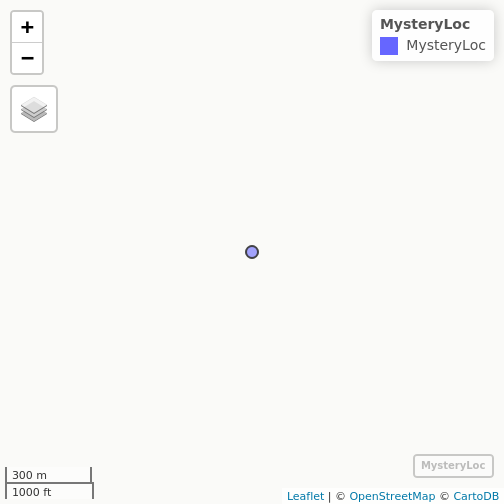
Before we get into making static maps we’ll cover a basic interactive map. Lots of people rely on ArcMap to view their data or for the ability to scroll through spatial data. The mapview package provides users with a basic, interactive map with several different baselayers with a single line of code. If you’re working in RStudio the map will open in the Viewer tab. If working in the console then the map will open in a web browser.
# Coordinates of a mystery location #
MysteryLocation <- cbind(71.73,43.94)

# Create a SpatialPoints layer with known crs
MysteryLoc <- SpatialPoints(MysteryLocation,proj4=CRS("+init=epsg:4326"))

# create an interactive map to reveal the mystery location
mapview(MysteryLoc)
Making Maps
Making maps is as much an art as it is a science and making nice maps takes a lot of practice. We won’t go into map making in great detail here. I’ll illustrate some features that you can use to maps in R. We’ll start with basic maps of spatial features like points and work our way up to plotting rasters with custom legends and finally to interactive plots.
Let’s read in the states SpatialPolygonsDataFrame using the raster package to get started.
# Get State boundaries
States <- raster::getData("GADM", country = "United States", level = 1)
Now let’s plot New Hampshire
# make NH polygon
NH <- States[States$NAME_1 == "New Hampshire",]

# plot a single polygon
plot(NH)
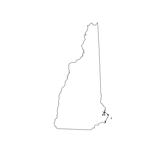
All we did was call the plot() function on our spatial polygon and it created a map. Pretty straight forward so far.
If you get the following error be sure to load the raster package before plotting. You get the following error because the basic plot function in R doesn’t know how to plot spatial data without raster or some other spatial package loaded.
Error in as.double(y) : cannot coerce type ‘S4’ to vector of type ‘double’<
Adding multiple spatial layers
Maps are often a few different spatial layers added together. Therefore, we need to know how to plot multiple spatial layers together to render maps. These next few lines of code will add a few different data layers together to make a map. First, we’ll generate some random points within New Hampshire and plot those. Then, we’ll put New Hampshire into context so it doesn’t look like its floating. Then we’ll add some color to add emphasis.
First the random points.
# Set the random seed
set.seed(12345)

# make random points within New Hampshire
randPts <- sp::spsample(x = NH, n = 100, type = "random")
Plot New Hampshire boundary
# Plot New Hampshire
plot(NH)
Add the random points on top of New Hampshire
# Add random points
plot(randPts,
     add = TRUE,
     pch = 19)
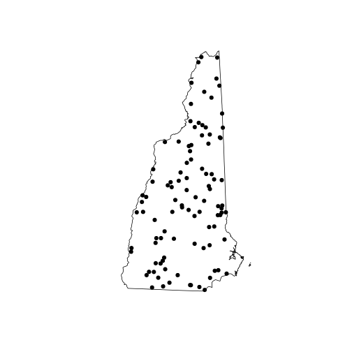
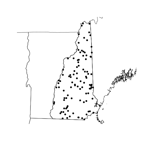
add the other state boundaries for context
# Add States for context
plot(States,
     add = TRUE)
Adding map extras
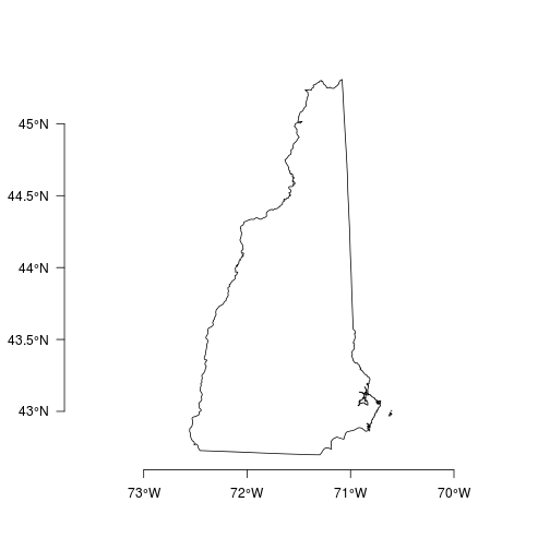
axes
Let’s add some location information like latitude and longitude for reference. The sp function has a nice axis helper to do just that and make it look ‘pretty’.
plot(NH)
sp::degAxis(side = 1)
sp::degAxis(side = 2,las = 2)
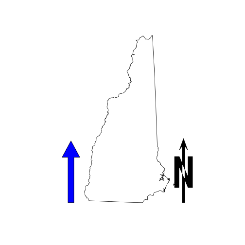
north arrow
The sp package also has a nice feature that generates a north arrow. We’ll put types on the same map. The layout.north.arrow function creates a spatial object that has spatial coordinates that are correct relative to themselves. Therefore, in order to place the north arrow on the map in locations that we want we can shift the spatial coordinates of the north arrow using the elide function in the maptools package.
There are two types of north arrow included in the layout.north.arrow function. The first type (type = 1) places a north arrow behind a capital N. The second type (type = 2) is a northward facing arrow.
plot(NH)
# generate the north arrow type 1
arrow1 <-  layout.north.arrow(type = 1)

# shift the coordinates
# shift = c(x,y) direction
Narrow1 <- maptools::elide(arrow1, shift = c(extent(NH)[2],extent(NH)[3]))

# add north arrow to current NH plot
plot(Narrow1, add = TRUE,col = "black")

# Make north arrow type 2
arrow2 <- layout.north.arrow(type = 2)

# shift the coordinates
# shift = c(x,y) direction
Narrow2 <- maptools::elide(arrow2, shift = c(extent(NH)[1]-0.5,extent(NH)[3]))

# add north arrow to current plot
plot(Narrow2, add = TRUE, col = "blue")
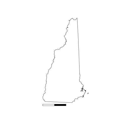
scalebar
Both raster package and the sp packages have a function to add a scale bar. The scalebar in the sp package is very basic.
# New Hampshire plot
plot(NH)
# scale bar layer
sb <- layout.scale.bar(height = 0.05)
# shift scale bar
sb_slide <- maptools::elide(sb, shift = c(extent(NH)[1],extent(NH)[3]-0.1))
# Add to plot
plot(sb_slide, add = TRUE, col = c("white","black"))
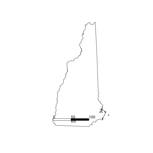
Now the scalebar in the raster package.
plot(NH)
#d = distance in km
#xy = location where to place scalebar
#type = "bar" or "line"
#divs = how many divisions in bar/line
#below = text below bar
#lonlat =  projection in longitude / latitude?
#label = labels for c(beginning, middle, end)
#adj = label adjustments c(horiz,vertical)
#lwd = width of line

raster::scalebar(d = 100, # distance in km
                 xy = c(extent(NH)[1]+0.01,extent(NH)[3]+0.15),
                 type = "bar",
                 divs = 2,
                 below = "km",
                 lonlat = TRUE,
                 label = c(0,50,100),
                 adj=c(0, -0.75),
                 lwd = 2)
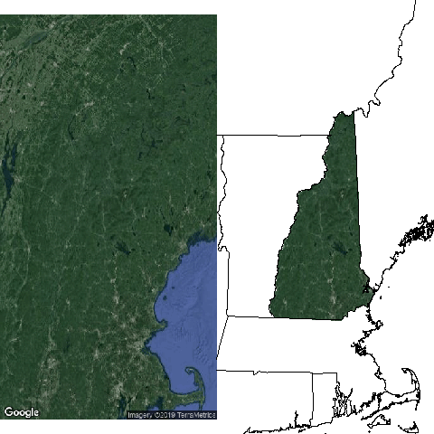
Adding Satellite Image
Adding satellite images from Google Earth is also possible. We’ll use the dismo package for that. The gmap() function returns a google map. Several types (“roadmap”, “satellite”, “hybrid”, “terrain”) are available. You can use the style option to customize colors, etc. See here for style options.
Note: To use Google maps you need to get an API key.
# Download a map from Google Maps API
# exp = multiplier to change extent
#       values less than 1 - zooms in
#       values greater than 1 - zooms out
# zoom = another parameter to
#       zoom in or out on areas
#     1 = global, 20 = pick out individual trees
# type = Type of image to return
# lonlat = return in crs lonlat?
# rgb - return raster stack with rgb values?

# Avoid weird white space by using using the rgb = TRUE &
# using raster's plotRGB function.

sat <- gmap(x = NH,
            exp = 1,
            map_key = "add your key here",
            zoom = NULL,
            type = "satellite",
            lonlat = FALSE,
            rgb = TRUE)

# plotRGB uses the raster stack to make the colors
raster::plotRGB(sat)
Plotting rasters
In this next section we’ll go through a few of the basics for plotting rasters. We’ll use an elevation raster of Hubbard Brook Experimental Forest in New Hampshire for the next few examples.
elev <- raster::raster("../Spatial_Layers/hb10mdem.txt")
Let’s take a quite look at what the elevation looks like.
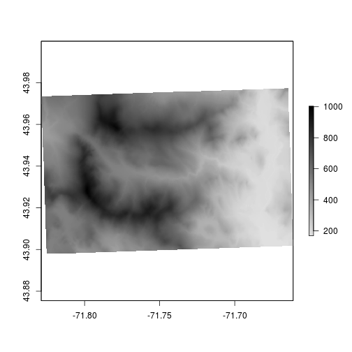
plot(elev)
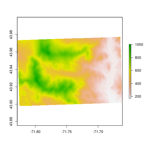
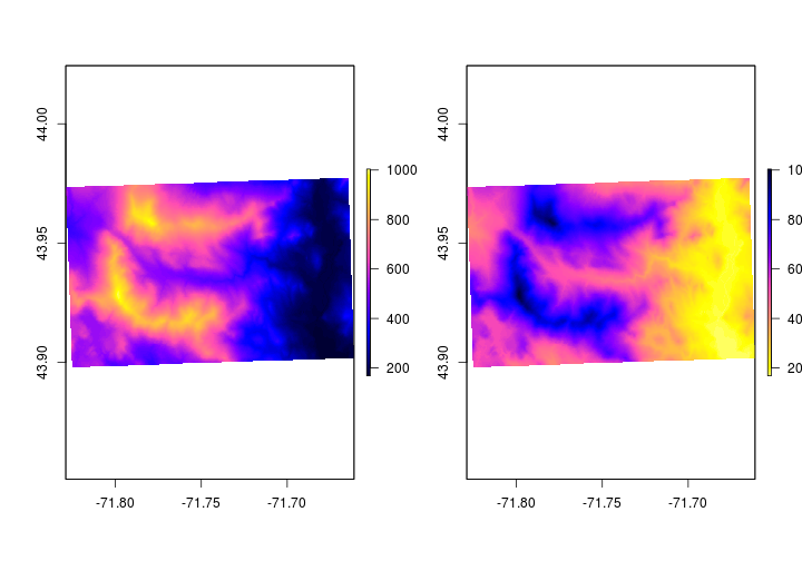
Let’s playing with the colors and assign colors to specific elevation bands. First, we’ll change the colors away from the default. You can change the colors using col option.
# Plot two plots c(rows,columns)
par(mfrow = c(1,2))
# plot elevation with blue.purple.yellow pallette
plot(elev,
     col = sp::bpy.colors())
# plot elevation with yellow.purple.blue pallette
plot(elev,
     col = rev(sp::bpy.colors()))
One way set different colors based on raster values you can use the breaks option. The breaks option sets the breaks for changes in colors. Before we set the breaks, let’s have a look at the values.
# plot histogram
hist(elev)
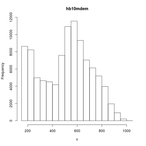
# get the minimum value
cellStats(elev,min)
## [1] 168
# get the maximum value
cellStats(elev,max)
## [1] 1004
# find quantiles of the elevation
quantile(elev, probs = c(0.25,0.5,0.75))
## 25% 50% 75%
## 337 536 654
We’ll illustrate how to use the breaks option by setting different colors for the quantiles. The below example is to show how to change the colors.
set.breaks <- quantile(elev, probs = c(0,0.25,0.5,0.75,1))
plot(elev,
     breaks = set.breaks,
     col = c("blue","yellow","green","red"))
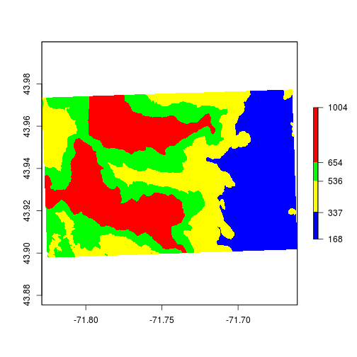
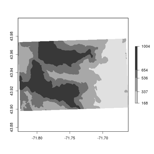
Because elevation is a continuous variable we should use some sort of color-ramp instead of discrete colors. You can use the colorRampPalette function to generate values.
# Generate color ramp from "gray88" to "black"
newcolors <- colorRampPalette(colors = c("gray88","black"))

# Use the set.breaks and colors
plot(elev,
     breaks = set.breaks,
     col = newcolors(5))
# Use 200 colors in the color ramp palette
plot(elev,
     col = newcolors(200))
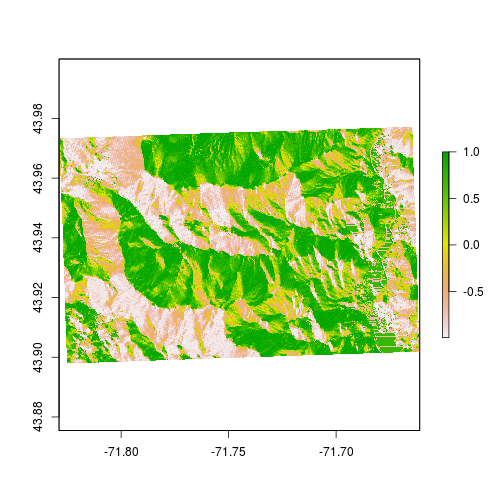
Here’s a little trick to make elevation maps look better. Let’s add some ‘topography’ by using the hillShade function. We can generate a hillshade layer by combining slope and aspect. The terrain function generates slope and aspect from the digital elevation model.
# generate aspect and slope
aspect <- raster::terrain(elev,"Aspect")
slope <- raster::terrain(elev,"Slope")

# combine aspect and ratio to generate hillshade
HS <- raster::hillShade(aspect,slope)

plot(HS)
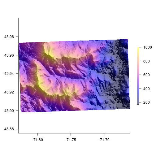
Now that we’ve generated some ‘texture’ we can add colors on top. The alpha option sets transparency. In order to add colors we need to plot two rasters on the same plot. When doing that the legends plot on top of one another. Let’s suppress the legend on the hillshade layer.
# add color over the hillshade
par(bty = "l") # only have x - y axis
plot(HS,
     col = gray(1:100/100),
     legend = FALSE, # don't plot legend
     las = 1) # axis labels are parallel with plot
plot(elev,
     col = bpy.colors(200),
     add = TRUE, #add to current plot
     alpha = 0.5) # set transparency
legends
Legend placement, orientation and size can all be altered to make the legend fit a map. Below we’ll go over a few options we can change to make legends look better.
horizontal legend
# no margins, no border #
par(mar = c(4,0,0,0),bty = "n")
# suppress axes
plot(HS,
     col = gray(1:100/100),
     legend = FALSE,
     axes = FALSE)
plot(elev,
     col = bpy.colors(200),
     horizontal = TRUE,
     alpha = 0.5,
     add = TRUE)
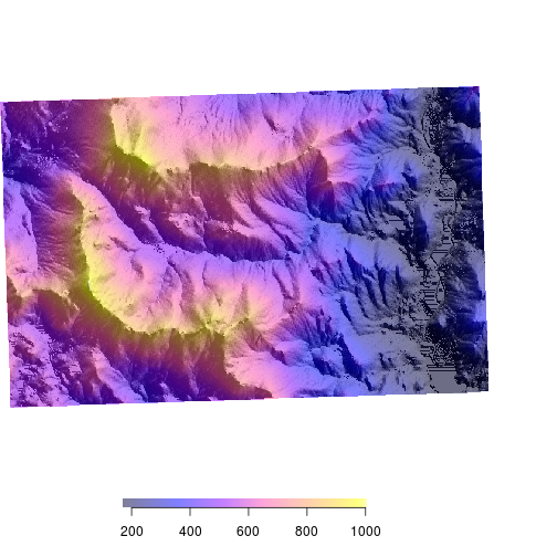
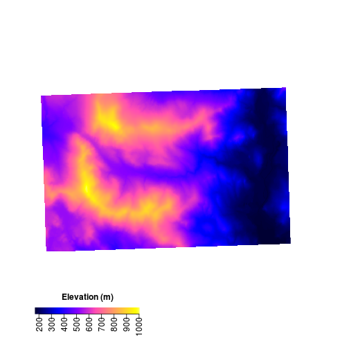
custom labels and placement We can use the smallplot option or move the legend around and the axis.args to change labels and label placement. Legend.args sets the large label “Elevation” in this case.
# smallplot
  # where to plot the legend
  # values between 0-1 (percent of plot)
  # c(x1,x2,y1,y2)
# axis.args
par(bty = "n")
plot(elev,
     col = bpy.colors(200),
     legend = FALSE,
     axes = FALSE)
plot(elev,
     legend.only = TRUE,
     horizontal = TRUE,
     col= bpy.colors(200),
     add = TRUE,
     smallplot = c(0.1,0.4,0.1,0.12),
     legend.width = 0.25,
     legend.shrink = 0.5,
     axis.args = list(at = seq(200,1000,100),
                      las = 2,
                      labels = seq(200,1000,100),
                      cex.axis = 1,
                      mgp = c(5,0.3,0)),
     legend.args = list(text = "Elevation (m)",
                      side = 3,
                      font = 2,
                      line = 0.5,
                      cex = 1))
Interactive plots
The leaflet package makes making interactive plots fairly straightforward once you learn the syntax. See here for lots more info on leaflet functions. The general workflow for interactive plots is:
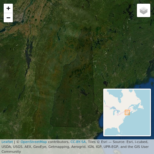
The following code creates a rather simple map with a small inset, two base layers the user can switch between and the polygon boundary is highlighted when the users mouse navigates over it.
# Read the State boundaries
States <- raster::getData("GADM",country = "United States", level = 1)

# Subset to include only New Hampshire
NH <- States[States$NAME_1 == "New Hampshire",]

# This call makes the map
  # inital map
mapNH <- leaflet(data = NH) %>%
  # add a baselayer
      addTiles() %>%
  # specific baselayer with name
   addProviderTiles("Esri.WorldImagery", group = "Aerial") %>%
  # specific baselayer with name
   addProviderTiles("OpenTopoMap", group = "Topography")%>%
  # add New Hampshire polygon
   addPolygons(., stroke = TRUE, weight = 1, color = "black",
  # highlight when over
      highlightOptions = highlightOptions(color = "white", weight = 2,
      bringToFront = TRUE)) %>%
 # Layers control
  # give user control of basemap
            addLayersControl(
      # these groups are labelled above
              baseGroups = c("Aerial", "Topography"),
        # collapse options
              options = layersControlOptions(collapsed = TRUE))
# add map inset to plot
mapNH %>% addMiniMap()